

aRE YOU READY TO LEVEL UP?
LEVEL UP STRATEGIES
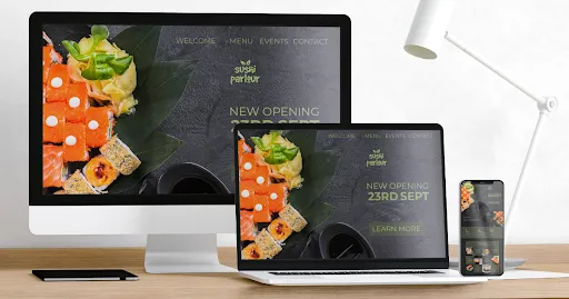
Responsive Design 101: Why Your Website Must Adapt
Introduction
Hey there! Ever visited a website on your phone and had to zoom in and out just to read the text or click a button? Annoying, right? That's where responsive design comes in. It's like having a website that's as flexible as a gymnast, adjusting perfectly to any device you're using. Let’s learn it with Level Up Business now.
So, why is this flexibility so important? Let's break it down:
Happy Visitors: Smooth Browsing Experience
When visitors land on your site, they expect a seamless journey, regardless of the device they're using. A responsive design ensures that whether they're on a smartphone, tablet, or laptop, they can effortlessly navigate through your site. This smooth experience translates into happy visitors who are more likely to engage with your content and stay longer on your site.
Google Likes It: Mobile-Friendly Boost
Google's algorithms prioritize mobile-friendly websites in search results. By having a responsive design, you not only cater to your visitors' needs but also please the search engines. This can lead to higher rankings, increased visibility, and ultimately, more organic traffic to your site.
More Sales, Anyone?: Enhanced User Engagement
Picture this scenario: a potential customer visits your site on their mobile device, and everything looks perfect. They find it easy to browse your products or services, leading to increased interest and the likelihood of making a purchase or reaching out to you. A responsive design plays a crucial role in optimizing user engagement and driving conversions.
Save Time and Money: Website Management
Rather than juggling multiple versions of your site for different devices, a responsive design can do everything into one cohesive platform. This consolidation suggested by website developers for small business can not only save you time and effort but also reduces the costs associated with managing and maintaining separate sites. It's a win-win situation for your business's efficiency and budget.
Stay Ahead of the Game: Future-Proofing Your Website
Technology evolves rapidly, and new devices continually enter the market. With a responsive website, you're future-proofing your online presence. You won't have to worry about redesigns or compatibility issues when new gadgets emerge. Instead, you'll be ready to adapt seamlessly and stay ahead of the competition.
The Mobile Revolution
Mobile devices have become the go-to choice now for accessing the internet. More people are using smartphones and tablets to browse websites, shop online, and interact with content. As a result, your website must adapt to this mobile revolution to meet the expectations of modern users.
Mobile Traffic Trends:
As per recent studies, mobile traffic has significantly surpassed desktop traffic. This shift in user behavior underscores the critical need to prioritize mobile users. With a responsive design, your website becomes accessible and engaging for mobile visitors. This accessibility leads to higher engagement levels and
ultimately boosts conversions as users find it convenient to interact with your site on their mobile devices.
Google's Mobile-First Indexing:
Google's mobile-first indexing strategy means that the search engine primarily considers the mobile version of websites when ranking search results. We emphasis on mobile-friendliness has become crucial for SEO success. Implementing a responsive design not only improves user experience but also signals to Google that your website is optimized for mobile users. This, in turn, enhances your website's visibility and rankings on Google's search results pages, driving more organic traffic to your site.
User Expectations:
Mobile users have specific expectations when browsing websites on their devices. They expect fast loading times, intuitive navigation, and visually appealing layouts. A responsive website meets these expectations by ensuring quick page loading, easy-to-navigate menus, and visually appealing designs that adapt seamlessly to various screen sizes. Meeting these expectations keeps users satisfied, encouraging them to engage more with your content and spend more time on your site.
Competitive Advantage:
Investing in responsive design provides your business with a competitive edge in today's digital landscape. A mobile-friendly website attracts a larger audience of mobile users, retains them longer on your site, and increases the likelihood of conversions. This advantage translates into better brand visibility, higher customer engagement, and ultimately, a stronger market position compared to competitors who have not optimized their websites for mobile devices.
Improved Accessibility:
Responsive design not only caters to mobile users but also improves accessibility for all users, including those with disabilities. A well-designed responsive website ensures that content is easily accessible and navigable, regardless of the device or assistive technologies being used. This inclusivity not only enhances user experience but also aligns with web accessibility standards, making your website more user-friendly and compliant with regulations.
Consistent Brand Experience:
Our custom website developers maintain responsive design and a consistent brand experience across all devices. Whether a user accesses your site on a smartphone, tablet, or desktop, they encounter the same brand identity, messaging, and design elements. This consistency reinforces brand recognition and trust, fostering a positive perception of your business among users. It also eliminates confusion and ensures a seamless transition for users navigating between different devices.
Adaptability to Device Diversity:
With the proliferation of various devices with different screen sizes, resolutions, and orientations, a responsive design adapts effortlessly to this device diversity. Your website will look and function optimally on devices ranging from large desktop monitors to small smartphones, without requiring separate versions or manual adjustments. This adaptability future-proofs your website, ensuring it remains effective and engaging regardless of the devices users may use now or in the future.
Conclusion
In a nutshell, responsive design is about making life easier for your visitors and boosting your online presence. At Level Up Business, our website developers for small businesses and large businesses are all about creating websites that look fantastic and work seamlessly across all devices, especially for small businesses like yours.
At Level Up Business, we specialize in creating responsive websites that adapt seamlessly to all devices, ensuring a superior user experience and driving business growth.
And if you want to have all of this taken care of without any trouble, consider Level Up custom Website developers. For just $99 per month, we'll handle everything, making your life easier and ensuring your website is always optimized for success.
Get in touch with us today and let's take your online presence to the next level!

aRE YOU READY TO LEVEL UP?
MESSAGE US IF YOU HAVE QUESTIONS
© 2024 Level Up Business
|
|
© 2024 Level Up Business